多个 Seaborn 图
Manav Narula
2024年2月15日
-
使用
seaborn.FacetGrid()绘制多个 Seaborn 图 -
使用
seaborn.PairGrid()绘制多个 Seaborn 图 -
在 Python 中使用
seaborn.pairplot()绘制多个 Seaborn 图

在本教程中,我们将讨论如何在 seaborn 模块中绘制多个图形。
使用 seaborn.FacetGrid() 绘制多个 Seaborn 图
FacetGrid() 类用于可视化数据分布与其他数据子集之间的关系,并可用于为多个图创建网格。
下面的代码展示了如何使用这个函数。
import pandas as pd
import matplotlib.pyplot as plt
import seaborn as sns

df = pd.DataFrame(
    {
        "Price": [7, 1, 5, 6, 3, 10, 5, 8],
        "Product": [1, 1, 1, 1, 2, 2, 2, 2],
        "Day": [1, 2, 3, 4, 5, 6, 7, 8],
    }
)

g = sns.FacetGrid(df, col="Product")
g.map(sns.lineplot, "Day", "Price")
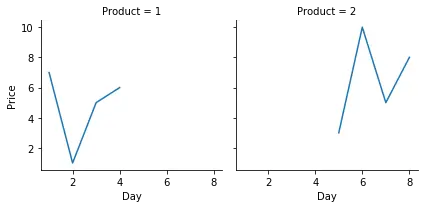
在为多个图定制网格后,我们在数据之间绘制了 lineplot()。应该注意的是,像 relplot()、lmplot() 和 catplot() 这样的不同 seaborn 图默认使用这个对象。
使用 seaborn.PairGrid() 绘制多个 Seaborn 图
此函数与 FacetGrid() 类非常相似。它需要一个 DataFrame 并将每一列绘制到网格的列和行,绘制多个轴。我们可以在这里使用 hue 参数来处理分类数据,每种颜色代表不同的类别。
下面的例子将解释它的使用。
import pandas as pd
import matplotlib.pyplot as plt
import seaborn as sns

df = pd.DataFrame(
    {
        "Price": [7, 1, 5, 6, 3, 10, 5, 8],
        "Product": [1, 1, 1, 1, 2, 2, 2, 2],
        "Day": [1, 2, 3, 4, 5, 6, 7, 8],
    }
)

g = sns.PairGrid(df, hue="Product")
g.map(sns.scatterplot)
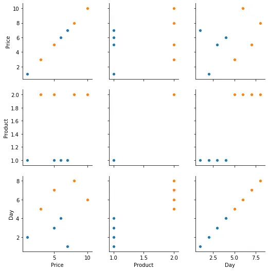
在上面的代码中,我们使用 DataFrame 并绘制变量之间的 scatterplot()。
在 Python 中使用 seaborn.pairplot() 绘制多个 Seaborn 图
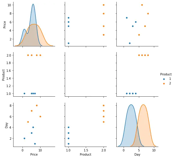
它用于绘制数据集列之间的成对分布。它还在两个轴上绘制 DataFrame 的所有列,这些列显示了显示不同类型图形的图矩阵,类似于 PairGrid() 类。此处显示了不同类型的图。
例如,
import pandas as pd
import matplotlib.pyplot as plt
import seaborn as sns

df = pd.DataFrame(
    {
        "Price": [7, 1, 5, 6, 3, 10, 5, 8],
        "Product": [1, 1, 1, 1, 2, 2, 2, 2],
        "Day": [1, 2, 3, 4, 5, 6, 7, 8],
    }
)

g = sns.pairplot(df, hue="Product")

plt.show()
作者: Manav Narula

Manav is a IT Professional who has a lot of experience as a core developer in many live projects. He is an avid learner who enjoys learning new things and sharing his findings whenever possible.
LinkedIn