在 R 中使用 ggplot 创建直方图
-
在 R 中使用
geom_histogram使用ggplot创建直方图 -
使用
fill、colour和size参数修改 R 中的直方图视觉效果 -
在 R 中使用
facet_wrap构建按类别分组的多个直方图
本文将演示如何在 R 中使用 ggplot 创建直方图。
在 R 中使用 geom_histogram 使用 ggplot 创建直方图
使用 geom_histogram 函数构建一个简单的直方图,它只需要一个变量来绘制图形。在这种情况下,我们使用 diamonds 数据集,即其中的 price 列,来指定到 x 轴的映射。除非用户明确传递,否则 geom_histogram 会自动选择 bin 大小和比例数据点。
library(ggplot2)

p1 <- ggplot(diamonds, aes(x = price)) +
  geom_histogram()

p1
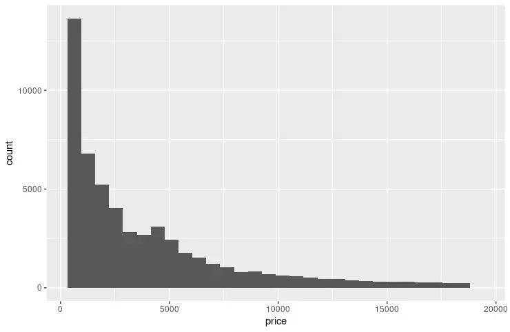
以下示例扩展了前面的代码片段,以使用 scale_x_continuous 和 scale_y_continuous 函数指定每个轴上的断点。breaks 参数用于传递由 seq 函数生成的值。seq 参数在形成模式时读起来很直观 - (from, to, by)。我们还利用 grid.arrange 函数并排显示两个图形以进行视觉比较。
library(ggplot2)
library(gridExtra)

p1 <- ggplot(diamonds, aes(x = price)) +
  geom_histogram()

p2 <- ggplot(diamonds, aes(x = price)) +
  geom_histogram() +
  scale_y_continuous(breaks = seq(1000, 14000, 2000)) +
  scale_x_continuous(breaks = seq(0, 18000, 2000))

grid.arrange(p1, p2, nrow = 2)
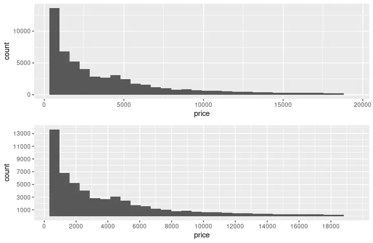
使用 fill、colour 和 size 参数修改 R 中的直方图视觉效果
诸如 fill、colour 和 size 等常用参数可用于更改图形箱的视觉效果。fill 参数指定填充 bin 的颜色;相比之下,colour 用于 bin 笔划。size 使用数值来表示 bin 笔划的宽度。另请注意,以下代码片段将 name 参数添加到两个轴。
library(ggplot2)
library(gridExtra)

p3 <- ggplot(diamonds, aes(x = price)) +
  geom_histogram(fill = "pink", colour = "brown") +
  scale_y_continuous(breaks = seq(1000, 14000, 2000)) +
  scale_x_continuous(breaks = seq(0, 18000, 2000))

p4 <- ggplot(diamonds, aes(x = price)) +
  geom_histogram(fill = "pink", colour = "brown", size = .3) +
  scale_y_continuous(breaks = seq(1000, 14000, 2000), name = "Number of diamonds" ) +
  scale_x_continuous(breaks = seq(0, 18000, 2000), name = "Price" )

grid.arrange(p3, p4, nrow = 2)
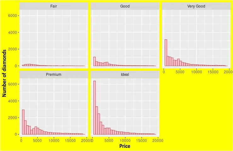
在 R 中使用 facet_wrap 构建按类别分组的多个直方图
facet_wrap 函数可用于根据变量集绘制多个直方图。diamonds 数据集提供了足够的维度来从其中一列中选择变量。例如,我们选择 cut 列来显示每种类型的不同 price 直方图。theme 函数也可以与 geom_histogram 结合使用来指定图形元素的自定义格式。
library(ggplot2)

p5 <- ggplot(diamonds, aes(x = price)) +
  geom_histogram(fill = "pink", colour = "brown", size = .3) +
  scale_y_continuous( name = "Number of diamonds" ) +
  scale_x_continuous( name = "Price" ) +
  facet_wrap(~cut) +
  theme(
    axis.title.x = element_text(
      size = rel(1.2), lineheight = .9,
      family = "Calibri", face = "bold", colour = "black"
    ),
    axis.title.y = element_text(
      size = rel(1.2), lineheight = .9,
      family = "Calibri", face = "bold", colour = "black"
    ),
    plot.background = element_rect("yellow"))


p5

Founder of DelftStack.com. Jinku has worked in the robotics and automotive industries for over 8 years. He sharpened his coding skills when he needed to do the automatic testing, data collection from remote servers and report creation from the endurance test. He is from an electrical/electronics engineering background but has expanded his interest to embedded electronics, embedded programming and front-/back-end programming.
LinkedIn