使用 Python Matplotlib 创建归一化直方图
Vaibhav Vaibhav
2022年5月11日

直方图是一种频率分布,它描述了数据集中不同元素的频率。该图通常用于研究频率并确定值在数据集中的分布方式。
直方图的归一化是指在 [0, 1] 范围内映射数据集的频率,包括两者。在本文中,我们将学习如何在 Python 中创建标准化直方图。
在 Python 中使用 Matplotlib 库创建归一化直方图
Matplotlib 模块是用于创建静态和交互式绘图的综合 Python 模块。它是一个非常健壮且简单的包,广泛用于数据科学的可视化目的。Matplotlib 可用于创建标准化直方图。这个模块有一个 hist() 函数。用于创建直方图。以下是 hist() 方法的函数定义。
matplotlib.pyplot.hist(x, bins=None, range=None, density=False, weights=None, cumulative=False, bottom=None, histtype='bar', align='mid', orientation='vertical', rwidth=None, log=False, color=None, label=None, stacked=False, *, data=None, **kwargs)
以下是我们将用于生成归一化直方图的参数的简要说明。
x:输入值的列表、元组或 NumPy 数组。density:用于绘制标准化值的布尔标志。默认情况下,它是False。color:直方图中条形的颜色。label:绘制值的标签。
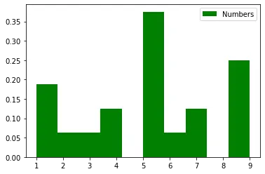
请参考以下 Python 代码来创建标准化直方图。
import matplotlib.pyplot as plt

x = [1, 9, 5, 7, 1, 1, 2, 4, 9, 9, 9, 3, 4, 5, 5, 5, 6, 5, 5, 7]
plt.hist(x, density=True, color="green", label="Numbers")
plt.legend()
plt.show()
输出:
作者: Vaibhav Vaibhav
