R 中的 Ylim()和 Xlim()
Manav Narula
2021年1月4日
圖形可以很好地洞察資料,幫助理解資料集中的關係。R 是這樣一個強大的資料分析工具有很多函式,如 ggplot()、plot() 等,這些函式可以幫助製作漂亮、有用的圖形和很多型別。
有時,人們可能需要確保圖位於某些值之間,而不超過這些值。在這種情況下可以使用的兩個函式是 ylim() 和 xlim() 函式。這兩個函式分別用來設定 y 軸和 x 軸的下限和上限。
先說說 ylim() 函式。它指定 y 軸的上限和下限。它是一個基本函式,可以在 ggplot()、plot() 等繪圖函式裡面作為引數使用。在下面的例子中,我們先繪製一個隨機分佈的基本散點圖,然後用 ylim() 將 y 軸的下限設為 0,上限設為 50。
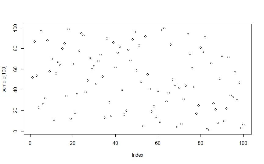
plot(sample(100))
plot(sample(100), ylim = c(0,50))
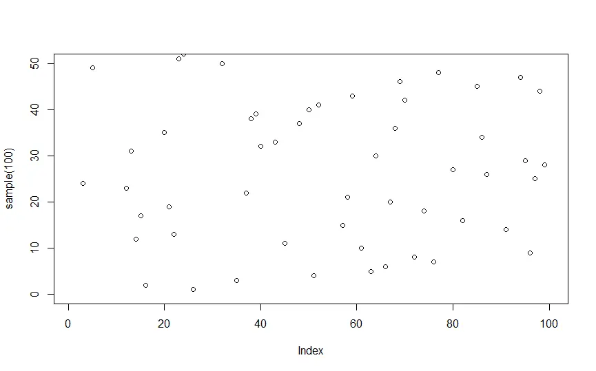
請注意設定上限和下限後 y 軸的變化。
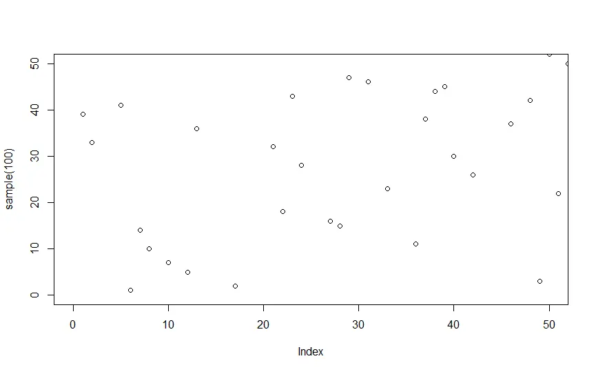
同樣,我們也可以使用 xlim() 函式來處理 x 軸。例如
plot(sample(100), ylim = c(0,50), xlim = c(0,50))
作者: Manav Narula

Manav is a IT Professional who has a lot of experience as a core developer in many live projects. He is an avid learner who enjoys learning new things and sharing his findings whenever possible.
LinkedIn