在 R 中使用 Caret 包視覺化混淆矩陣

本文將演示使用 R 中的 caret 包視覺化混淆矩陣的多種方法。
在 R 中使用 confusionMatrix 函式建立混淆矩陣
confusionMatrix 函式是 caret 包的一部分,可以從因子或表資料型別建立混淆矩陣。請注意,我們使用 sample 和 rep 函式構造了兩個隨機因子。confusionMatrix 將預測類別的因子作為第一個引數,將用作真實結果的類別因子作為第二個引數。
library(caret)

confusionMatrix(
  factor(sample(rep(letters[1:4], 200), 50)),
  factor(sample(rep(letters[1:4], 200), 50)))
Confusion Matrix and Statistics

          Reference
Prediction a b c d
         a 2 5 6 2
         b 3 2 4 2
         c 3 5 2 2
         d 5 1 2 4

Overall Statistics

               Accuracy : 0.2
                 95% CI : (0.1003, 0.3372)
    No Information Rate : 0.28
    P-Value [Acc > NIR] : 0.9260

                  Kappa : -0.0672

 Mcnemar's Test P-Value : 0.7795

Statistics by Class:

                     Class: a Class: b Class: c Class: d
Sensitivity            0.1538   0.1538   0.1429   0.4000
Specificity            0.6486   0.7568   0.7222   0.8000
Pos Pred Value         0.1333   0.1818   0.1667   0.3333
Neg Pred Value         0.6857   0.7179   0.6842   0.8421
Prevalence             0.2600   0.2600   0.2800   0.2000
Detection Rate         0.0400   0.0400   0.0400   0.0800
Detection Prevalence   0.3000   0.2200   0.2400   0.2400
Balanced Accuracy      0.4012   0.4553   0.4325   0.6000
在 R 中使用 fourfoldplot 函式視覺化混淆矩陣
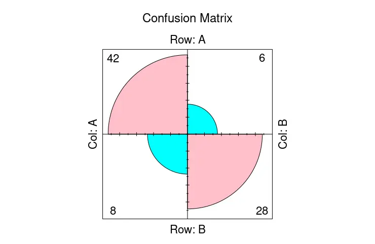
confusionMatrix 函式輸出文字資料,但我們可以在 fourfoldplot 函式的幫助下將其中的一部分視覺化。fourfoldplot 用 k 列聯表構造一個二乘二的四重圖。如果 k 等於 1,列聯表應以陣列形式或作為 2x2 矩陣傳遞。請注意,以下示例演示了 fourfoldplot 與硬編碼表資料的用法。
ctable <- as.table(matrix(c(42, 6, 8, 28), nrow = 2, byrow = TRUE))
fourfoldplot(ctable, color = c("cyan", "pink"),
             conf.level = 0, margin = 1, main = "Confusion Matrix")
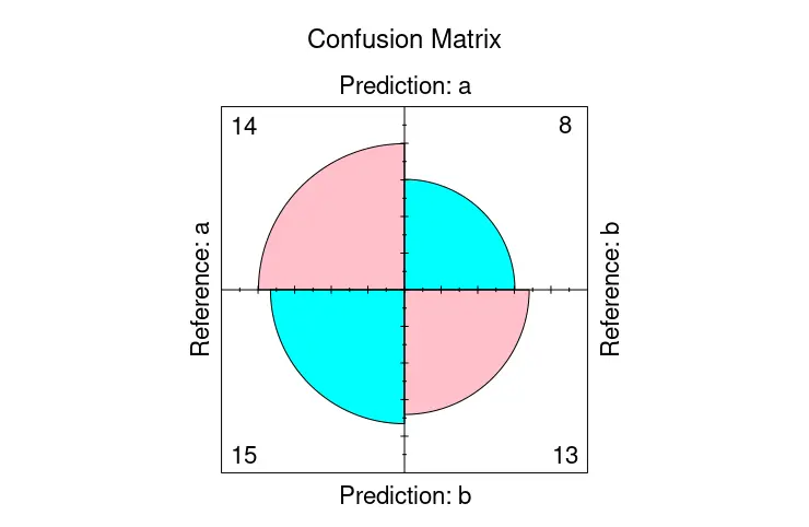
另一方面,我們可以將 confusionMatrix 儲存為一個物件,並將其中的 table 成員傳遞給 fourfoldplot 以視覺化混淆矩陣。
library(caret)

cmat <- confusionMatrix(
  factor(sample(rep(letters[1:2], 200), 50)),
  factor(sample(rep(letters[1:2], 200), 50)))

fourfoldplot(cmat$table, color = c("cyan", "pink"),
             conf.level = 0, margin = 1, main = "Confusion Matrix")
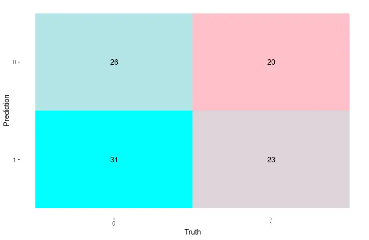
在 R 中使用 autoplot 函式視覺化混淆矩陣
或者,我們可以利用 ggplot2 包中的 autoplot 函式來顯示混淆矩陣。在這種情況下,我們使用 conf_mat 函式構造矩陣,該函式生成 conf_mat 類的物件,該物件可以作為第一個引數直接傳遞給 autoplot 函式。後者自動確定為物件繪製相應的圖形。
library(yardstick)
library(ggplot2)

set.seed(123)
truth_predicted <- data.frame(
  obs = sample(0:1,100, replace = T),
  pred = sample(0:1,100, replace = T)
)
truth_predicted$obs <- as.factor(truth_predicted$obs)
truth_predicted$pred <- as.factor(truth_predicted$pred)

cm <- conf_mat(truth_predicted, obs, pred)

autoplot(cm, type = "heatmap") +
  scale_fill_gradient(low = "pink", high = "cyan")

Founder of DelftStack.com. Jinku has worked in the robotics and automotive industries for over 8 years. He sharpened his coding skills when he needed to do the automatic testing, data collection from remote servers and report creation from the endurance test. He is from an electrical/electronics engineering background but has expanded his interest to embedded electronics, embedded programming and front-/back-end programming.
LinkedIn