R 中的正態概率圖
Sheeraz Gul
2022年5月26日

正態概率圖是資料的圖形表示。本教程演示如何在 R 中繪製正態概率。
R 中的正態概率圖
正態概率圖顯示給定資料集的正態分佈。它將資料集與正態分佈進行比較。
如果資料是正態分佈的,它應該顯示一條直線。我們可以使用 ggplot2 和 ggplotr 包來繪製正態概率圖。
首先,安裝這些包:
install.packages("ggplot2")

install.packages("qqplotr")
成功安裝軟體包後,我們將為正態分佈建立一個資料集,我們將為其繪製正態概率圖。我們將使用函式 stat_qq_point() 和 stat_qq_line() 來繪製正態概率。
參見示例:
install.packages("ggplot2")
install.packages("qqplotr")
library(ggplot2)
library(qqplotr)
# random data for normal distribution
normal_distribution = rnorm(1000, mean = 110, sd = 60)
# plot the data without line and labels
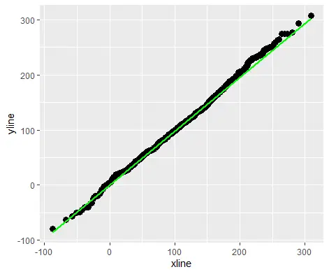
ggplot(mapping = aes(sample = normal_distribution)) + stat_qq_point(size = 3)+ stat_qq_line(color="green")
上面的程式碼將用綠色直線繪製給定資料的正態概率圖。見輸出:
作者: Sheeraz Gul

Sheeraz is a Doctorate fellow in Computer Science at Northwestern Polytechnical University, Xian, China. He has 7 years of Software Development experience in AI, Web, Database, and Desktop technologies. He writes tutorials in Java, PHP, Python, GoLang, R, etc., to help beginners learn the field of Computer Science.
LinkedIn Facebook