使用 R 中的 Lines() 函式在繪圖中新增一條線

本文將介紹如何使用 R 中的 lines() 函式在繪圖中新增一條線。
在 R 中使用 lines() 函式的繪圖中新增一條線
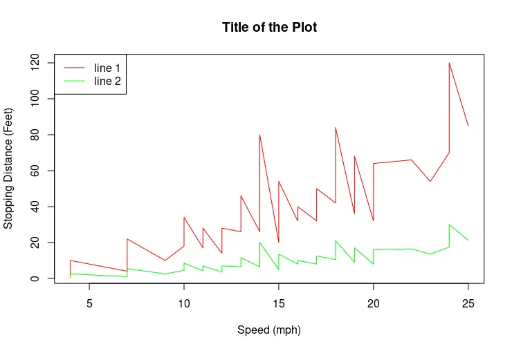
lines() 函式是 R graphics 包的一部分,用於向繪圖新增線條。首先,應該呼叫 plot 函式來構造一個圖,其中有一個由前兩個引數指定的變數對映。請注意,表示 y 軸座標的第二個引數是可選的。繪製繪圖後,我們可以呼叫 lines() 函式並根據需要傳遞座標向量以將線條新增到繪圖中。plot 函式不需要為 lines() 函式繪製折線圖。
library(stats)
library(babynames)
library(dplyr)

plot(cars$speed, cars$dist, type = "l", col = "red",
     main = "Title of the Plot",
     xlab = "Speed (mph)",
     ylab = "Stopping Distance (Feet)")

lines(cars$speed, cars$dist/4 , col = "green")

legend("topleft", c("line 1", "line 2"),
       lty = c(1,1),
       col = c("red", "green"))
在 R 中使用 points 的繪圖中新增點
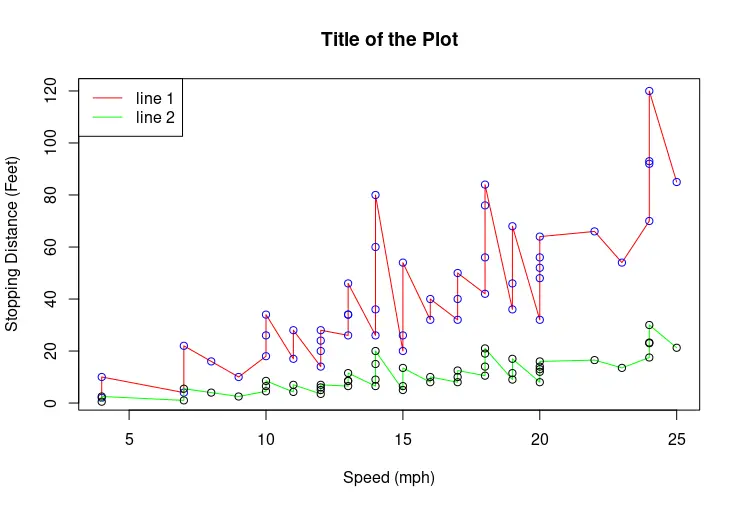
與 lines() 函式類似,graphics 包提供了 points() 函式來在圖中繪製點。以下示例演示了在同一繪圖上進行兩條線和點對映的場景。但是請注意,原始折線圖是使用 plot 函式繪製的。
library(stats)
library(babynames)
library(dplyr)

plot(cars$speed, cars$dist, type = "l", col = "red",
     main = "Title of the Plot",
     xlab = "Speed (mph)",
     ylab = "Stopping Distance (Feet)")
points(cars$speed, cars$dist, col = "blue" )

lines(cars$speed, cars$dist/4 , col = "green")
points(cars$speed, cars$dist/4 , col = "black")

legend("topleft", c("line 1", "line 2"),
       lty = c(1,1),
       col = c("red", "green"))
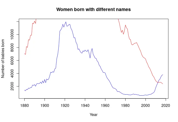
plot 和 lines 函式呼叫順序影響繪圖的比例
有時,使用第一個函式呼叫對映的資料的比例不足以進行後續對映。下一個程式碼片段顯示其中一條線幾乎超出了圖中的邊界。
library(stats)
library(babynames)
library(dplyr)

dat <- babynames %>%
  filter(name %in% c("Alice")) %>% filter(sex=="F")
dat2 <- babynames %>%
  filter(name %in% c("Mary")) %>% filter(sex=="F")

plot(dat$year, dat$n, type = "l", col = "blue",
     main = "Women born with different names",
     xlab = "Year",
     ylab = "Number of babies born")
lines(dat2$year, dat2$n, col = "red")
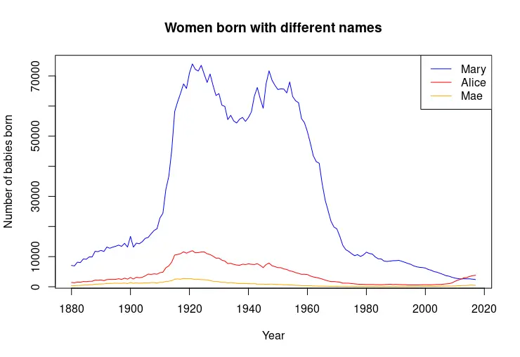
請注意,可以通過手動重新排序行來解決上一個問題,如下例所示。但是,更復雜的指令碼可能需要構造條件語句並動態檢查 y 軸資料的最大值。
library(stats)
library(babynames)
library(dplyr)

dat <- babynames %>%
  filter(name %in% c("Alice")) %>% filter(sex=="F")
dat2 <- babynames %>%
  filter(name %in% c("Mary")) %>% filter(sex=="F")
dat3 <- babynames %>%
  filter(name %in% c("Mae")) %>% filter(sex=="F")

plot(dat2$year, dat2$n, type = "l", col = "blue",
     main = "Women born with different names",
     xlab = "Year",
     ylab = "Number of babies born")
lines(dat$year, dat$n, col = "red")
lines(dat3$year, dat3$n, col = "orange")

legend("topright", c("Mary", "Alice", "Mae"),
       lty = c(1,1,1),
       col = c("blue", "red", "orange"))

Founder of DelftStack.com. Jinku has worked in the robotics and automotive industries for over 8 years. He sharpened his coding skills when he needed to do the automatic testing, data collection from remote servers and report creation from the endurance test. He is from an electrical/electronics engineering background but has expanded his interest to embedded electronics, embedded programming and front-/back-end programming.
LinkedIn