如何在 Matplotlib 中繪製一個表格
Suraj Joshi
2020年11月7日

我們可以使用 matplotlib.pyplot.table 方法在 Matplotlib 中繪製一個表格。
matplotlib.pyplot.table() 方法
matplotlib.pyplot.table() 語法
matplotlib.pyplot.table(
    cellText=None,
    cellColours=None,
    cellLoc="right",
    colWidths=None,
    rowLabels=None,
    rowColours=None,
    rowLoc="left",
    colLabels=None,
    colColours=None,
    colLoc="center",
    loc="bottom",
    bbox=None,
    edges="closed",
    **kwargs
)
示例: 在 Matplotlib 中使用 matplotlib.pyplot.table() 方法繪製一個表格
import matplotlib.pyplot as plt

fig, ax = plt.subplots(1, 1)
data = [[1, 2, 3], [5, 6, 7], [8, 9, 10]]
column_labels = ["Column 1", "Column 2", "Column 3"]
ax.axis("tight")
ax.axis("off")
ax.table(cellText=data, colLabels=column_labels, loc="center")

plt.show()
輸出:
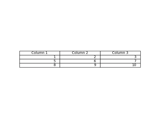
該方法從 table() 方法中作為 cellText 引數傳遞的資料生成一個表格。列名可以用 colLabels 引數指定,loc="center"將表格置於各軸的中心。
我們也可以通過 Pandas DataFrame 和 NumPy Arrays 作為 cellText 引數來生成表格。
import pandas as pd
import matplotlib.pyplot as plt

fig, ax = plt.subplots(1, 1)
data = [[1, 2, 3], [5, 6, 7], [8, 9, 10]]
column_labels = ["Column 1", "Column 2", "Column 3"]
df = pd.DataFrame(data, columns=column_labels)
ax.axis("tight")
ax.axis("off")
ax.table(
    cellText=df.values, colLabels=df.columns, rowLabels=["A", "B", "C"], loc="center"
)

plt.show()
輸出:
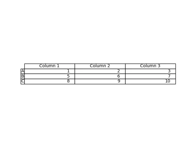
這個過程從 DataFrame df 生成表格。我們將 df 的值作為 cellText 引數,將 df 的列名作為 colLabels 引數。rowLabels 值作為表的行標籤。
為了區分表中的行標籤和列標籤,要對這些特定欄位進行不同的樣式。
import pandas as pd
import matplotlib.pyplot as plt

fig, ax = plt.subplots(1, 1)
data = [[1, 2, 3], [5, 6, 7], [8, 9, 10]]
column_labels = ["Column 1", "Column 2", "Column 3"]
df = pd.DataFrame(data, columns=column_labels)
ax.axis("tight")
ax.axis("off")
ax.table(
    cellText=df.values,
    colLabels=df.columns,
    rowLabels=["A", "B", "C"],
    rowColours=["yellow"] * 3,
    colColours=["yellow"] * 3,
    loc="center",
)

plt.show()
輸出:
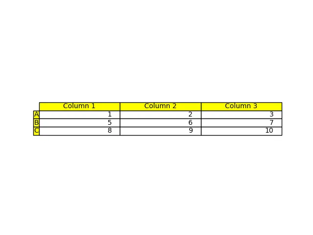
在這裡,我們將行標籤和列標籤用黃色來區分這些欄位與表的其他部分;這是用引數 rowColours 和 colColours 來完成的。
作者: Suraj Joshi

Suraj Joshi is a backend software engineer at Matrice.ai.
LinkedIn