使用 Python Matplotlib 建立歸一化直方圖
Vaibhav Vaibhav
2022年5月11日

直方圖是一種頻率分佈,它描述了資料集中不同元素的頻率。該圖通常用於研究頻率並確定值在資料集中的分佈方式。
直方圖的歸一化是指在 [0, 1] 範圍內對映資料集的頻率,包括兩者。在本文中,我們將學習如何在 Python 中建立標準化直方圖。
在 Python 中使用 Matplotlib 庫建立歸一化直方圖
Matplotlib 模組是用於建立靜態和互動式繪圖的綜合 Python 模組。它是一個非常健壯且簡單的包,廣泛用於資料科學的視覺化目的。Matplotlib 可用於建立標準化直方圖。這個模組有一個 hist() 函式。用於建立直方圖。以下是 hist() 方法的函式定義。
matplotlib.pyplot.hist(x, bins=None, range=None, density=False, weights=None, cumulative=False, bottom=None, histtype='bar', align='mid', orientation='vertical', rwidth=None, log=False, color=None, label=None, stacked=False, *, data=None, **kwargs)
以下是我們將用於生成歸一化直方圖的引數的簡要說明。
x:輸入值的列表、元組或 NumPy 陣列。density:用於繪製標準化值的布林標誌。預設情況下,它是False。color:直方圖中條形的顏色。label:繪製值的標籤。
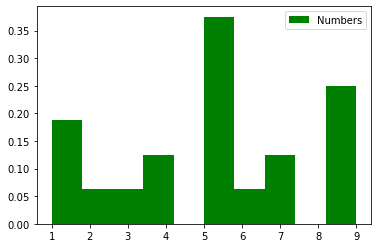
請參考以下 Python 程式碼來建立標準化直方圖。
import matplotlib.pyplot as plt

x = [1, 9, 5, 7, 1, 1, 2, 4, 9, 9, 9, 3, 4, 5, 5, 5, 6, 5, 5, 7]
plt.hist(x, density = True, color = "green", label = "Numbers")
plt.legend()
plt.show()
輸出:
Author: Vaibhav Vaibhav
