Python 中的 Matplotlib.pyplot.specgram()來繪製頻譜圖
Suraj Joshi
2023年1月30日

本教程介紹了我們如何使用 matplotlib.pyplot.specgram() 和 scipy.signal.spectrogram() 方法在 Python 中繪製頻譜圖。
我們可以通過頻譜圖得到訊號強度的詳細資訊。頻譜圖中某一點的顏色越深,說明該點的訊號越強。
使用 matplotlib.pyplot.specgram() 方法繪製頻譜圖
matplotlib.pyplot.specgram(x,
                           NFFT=None,
                           Fs=None,
                           Fc=None,
                           detrend=None,
                           window=None,
                           noverlap=None,
                           cmap=None,
                           xextent=None,
                           pad_to=None,
                           sides=None,
                           scale_by_freq=None,
                           mode=None,
                           scale=None,
                           vmin=None,
                           vmax=None, *,
                           data=None,
                           **kwargs)
示例: 使用 matplotlib.pyplot.specgram() 方法繪製頻譜圖
import math
import numpy as np
import matplotlib.pyplot as plt

dt = 0.0001
w = 2
t = np.linspace(0, 5, math.ceil(5 / dt))
A = 20 * (np.sin(3 * np.pi * t))

plt.specgram(A, Fs=1)
plt.title("Spectrogram Using matplotlib.pyplot.specgram() method")
plt.show()
輸出:
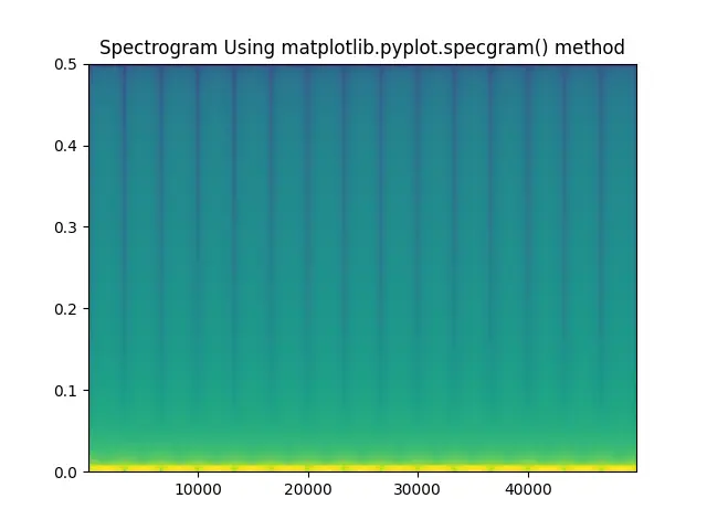
它使用 matplotlib.pyplot.specgram() 方法為函式 A=20sin(3*np.pi*t) 建立一個頻譜圖。該方法中的引數 fs 代表取樣頻率。
使用 scipy.signal.spectrogram() 方法繪製頻譜圖
import math
import numpy as np
import matplotlib.pyplot as plt
from scipy import signal

dt = 0.0001
w = 2
t = np.linspace(0, 5, math.ceil(5 / dt))
A = 2 * (np.sin(1 * np.pi * 300 * t))

f, t, Sxx = signal.spectrogram(A, fs=1, nfft=514)
plt.pcolormesh(t, f, Sxx)
plt.ylabel("Frequency")
plt.xlabel("Time")
plt.title("Spectrogram Using scipy.signal.spectrogram() method")
plt.show()
輸出:
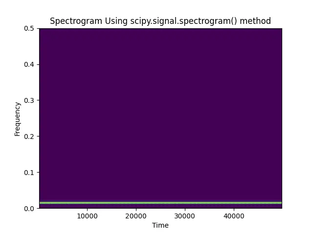
它使用 scipy.signal.spectrogram() 方法為函式 A=2sin(300*np.pi*t) 建立一個頻譜圖。該方法中的引數 fs 代表取樣頻率,ntft 代表所用 FFT 的長度。
該方法返回三個值 f、t 和 Sxx。f 代表取樣頻率陣列,t 代表取樣時間陣列,Sxx 代表 A 的頻譜圖。
這種方法並不能生成輸入訊號的頻譜圖。我們可以使用 matplotlib.pyplot.colormesh() 來生成圖形。
作者: Suraj Joshi

Suraj Joshi is a backend software engineer at Matrice.ai.
LinkedIn